
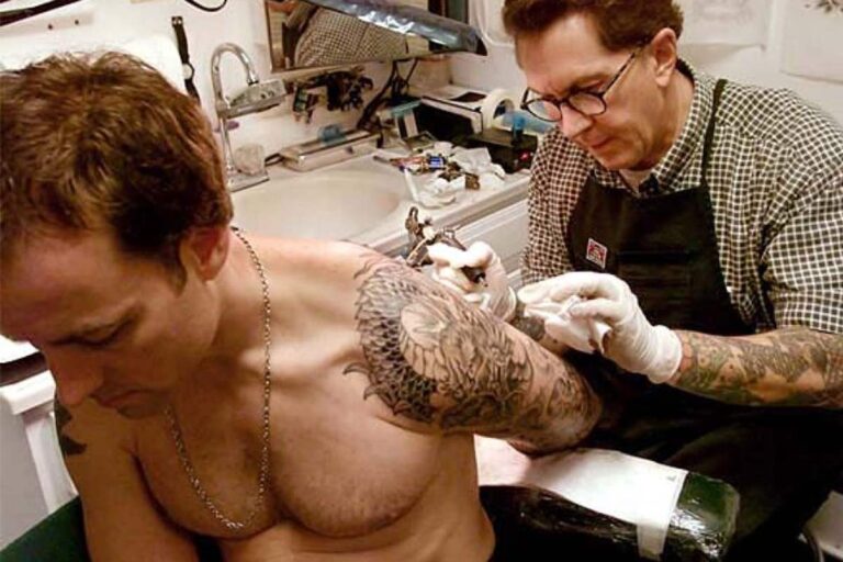
When it comes to tattoos, color is one of the most crucial elements that can make or break the design. The right combination of colors can bring a tattoo to life, adding depth, dimension, and emotion.
But with so many to choose from, how do you know which ones go best together? If you’re reading this, chances are you’re contemplating getting inked and are overwhelmed by the rainbow of possibilities.
Or perhaps you’re a seasoned tattoo lover looking to add a splash of color to your existing ink portfolio.
Either way, you’re in the right place!
The Color Wheel
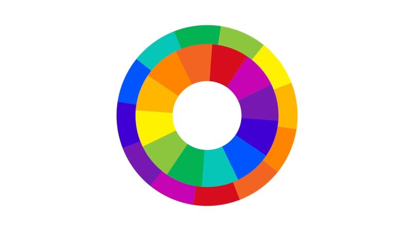
The color wheel is a visual representation of colors arranged according to their chromatic relationship.
It’s a tool that artists, designers, and yes, tattoo artists, use to understand how different colors relate to each other.
Primary colors are the foundation of all other colors on the wheel. These are:
- Red
- Blue
- Yellow
Secondary colors are created by mixing two primary colors. The secondary colors are:
- Green
- Orange
- Purple
Tertiary colors are made by mixing a primary and a secondary color, like:
- Red-orange
- Blue-green
Complementary and Analogous Colors
Complementary colors are opposite each other on the color wheel, like red and green or blue and orange.
When used together, they create a vibrant, high-contrast look.
Because they are so different, they can also clash if not used carefully. Analogous colors are next to each other on the color wheel, like:
- Red
- Orange
- Yellow
- Blue
- Green
- Teal
These naturally go well together and create a harmonious, calming effect.
They’re often used in tattoos to create gradients or to add depth and dimension.
The Role of Skin Tone
Skin tone plays a significant role in how a tattoo’s colors will appear. What looks vibrant and stunning on one person might look washed out or dull on another.
Warm, Cool, and Neutral Undertones
Skin undertones can be categorized as warm, cool, or neutral. Warm undertones have a golden or yellow base, while cool undertones have a blue or pink base.
Neutral undertones are a mix of both. Knowing your undertone can help you select colors that will complement your skin.
For example, warm undertones often work well with earthy colors like browns, oranges, and greens, while cool undertones are complemented by jewel tones like sapphire blue, emerald green, or amethyst purple.
Neutral undertones are versatile and can usually pull off a broader range of colors.
The Fitzpatrick Scale
The Fitzpatrick Scale is a numerical classification of skin color and how it reacts to UV light.
It ranges from Type I (very fair skin that burns easily) to Type VI (dark skin that rarely burns).
Your position on the Fitzpatrick Scale can influence how well certain colors will show up on your skin and how they might fade over time.
For instance, lighter skin tones (Types I-III) can generally accommodate a wider range of colors, including pastels and lighter shades.
Darker skin tones (Types IV-VI) may find that brighter, more saturated colors show up better and last longer.
Classic Color Combinations
Some color combinations are timeless and have been popular in the tattoo world for decades.
These classic combos can be a safe bet if you’re looking for something that will stand the test of time.
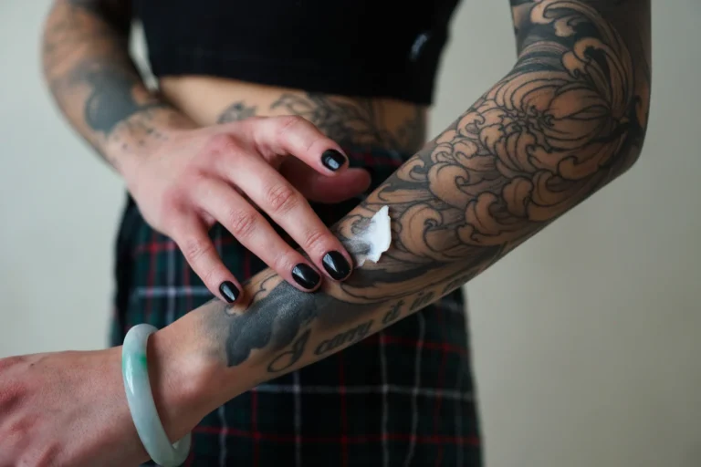
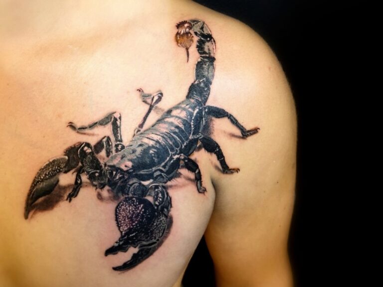
Black and Gray
Black and gray is a classic color combination that offers a timeless, elegant look.
Black ink provides the outlines and shading, while gray ink adds depth and dimension.
This combo is versatile and works well for various tattoo styles, from realism to traditional.
The monochromatic palette allows for a focus on texture and form, making it an excellent choice for tattoos that feature intricate details or shading.
It’s also a good option for those who prefer a more subdued look, as it’s less vibrant than some of the other color combinations we’ll discuss.
Red and Black
Red and black is another classic combo that’s been popular for years.
The contrast between the deep black and vibrant red creates a striking, eye-catching effect.
This combination is often used in traditional, tribal, and Japanese tattoo styles.
The boldness of red and black makes it ideal for tattoos that you want to stand out.
However, it’s essential to consider your skin tone when opting for this combo.
Red can look different depending on your undertone and may require a more saturated hue to show up well on darker skin tones.
Trending Color Palettes

Trends in tattoo colors come and go, but some palettes capture the zeitgeist and become emblematic of a particular time or cultural movement.
If you’re looking to make a statement with your tattoo, consider these trending color combinations.
Pastels
Pastel colors like soft pinks, blues, and purples have gained popularity in recent years, especially among younger generations.
These offer a softer, more whimsical look compared to traditional tattoo colors.
However, pastels can be tricky. They may not show up as vividly on darker skin tones and are prone to fading more quickly than darker, more saturated colors.
If you’re considering a pastel tattoo, consult with your artist about how best to achieve the look you want while considering the longevity of the ink.
Earth Tones
Earth tones like browns, greens, and deep blues are making a comeback, particularly in nature-themed and bohemian-style tattoos.
These offer a more muted, natural look that can be both striking and subtle.
Earth tones are versatile and tend to work well with various skin tones.
Because they are less vibrant, they may require more frequent touch-ups to maintain their original look.
As always, consult with your tattoo artist for personalized advice.
Psychology of Color
By knowing the psychology behind color choices can help you select a palette that aligns with the message or emotion you want to convey.
Emotional Impact
Colors can evoke specific emotions and associations.
For example, red is often associated with passion, love, or anger, while blue can signify calmness or sadness.
Yellow is generally linked to happiness and energy, and green often represents nature or growth.
When choosing colors for your tattoo, consider the emotional impact you want it to have.
Do you want your tattoo to evoke a sense of calm, or are you aiming for something more energetic and vibrant?
The ones you choose can help communicate this.
Cultural Significance
Colors can also carry cultural meanings that vary from one society to another.
For example, in some cultures, white is associated with purity and innocence, while in others, it’s linked to mourning and death.
If your tattoo features symbols or themes from a specific culture, it’s essential to understand the color meanings within that context.
It will help ensure that your tattoo is not only aesthetically pleasing but also culturally sensitive and appropriate.
